Make it Rain...

Posted by Ebun | Posted in | Posted on 3:43 AM

1

Sorry for the corny, three-years-too-late title, couldn't think of anything better at 3:30 am.  Anyhow, earlier in the semester we were given two days to design something at our site (off Girard Avenue near the zoo in Philadelphia, PA) that was sustainable and/or heightened a certain experience of the site.  Upon entering our site, I got an overwhelming sense of deadness and decay and I chose to play with that notion.

First, it's winter time, so all the leaves are brown and crusty, the trees are bare and skinny.  However, the sun still shines and it still rains, or snows.  These are both catalysts that are necessary for life.  Thus, I chose to design  something simple that harnessed these natural elements and fostered life and growth.

What I came up with is something new for me as a designer.  It is every bit "me" (simple, straightforward) but this time I chose to experiment with triangular geometry in the form of the "pod" that has the potential to be very complex.  When it rains, the rain is filtered through the "roof" and collected in a receptacle underground which in turn irrigates plants that the "farmer" grows to sustain himself within an otherwise dead site.  There is also a glass panel above that acts in the same way a magnifying glass does and focuses the sun's energy to one point. Photosynthesis, baby. Anyway, here are some of my sketches and pictures of the pod. Enjoy.


This one is just a study of form. I really like it, whatever it is. Enjoy as well.


Love, again.

Posted by Ebun | Posted in | Posted on 12:00 AM

2

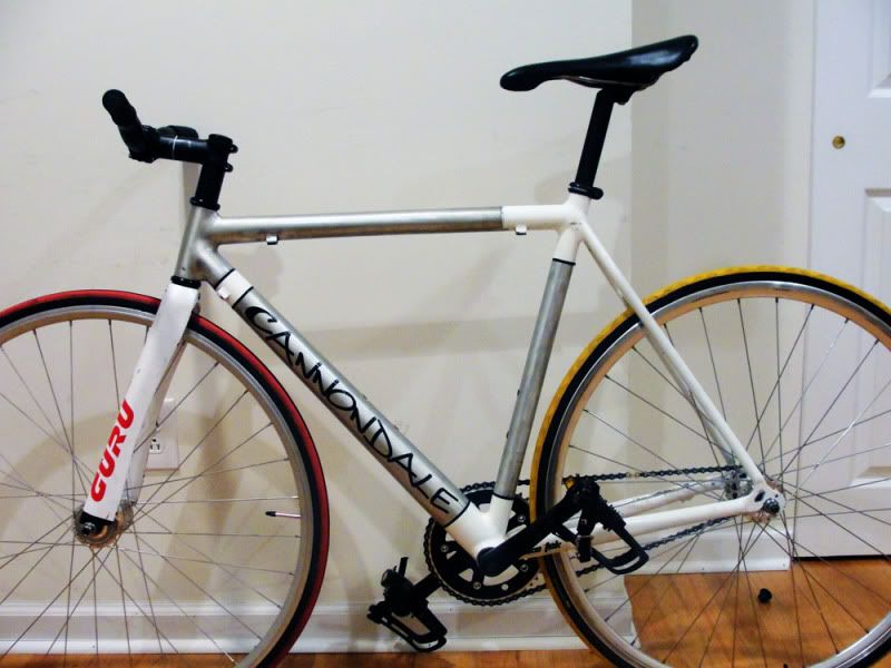
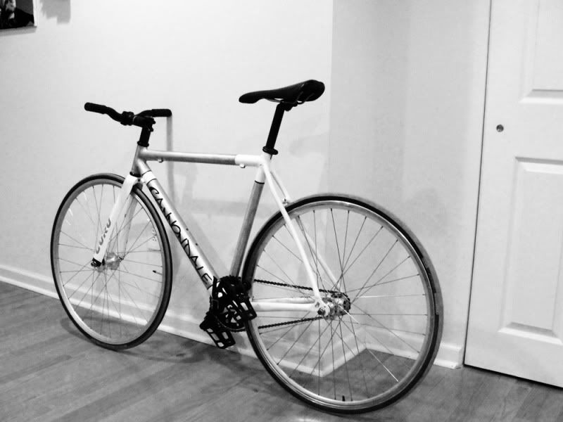
I feel very accomplished right now. It feels like I'm making moves left and right, getting things that I want done. It's truly a great feeling, but it also costs quite a bit of $$ lol.  I'm not sure if I mentioned this, but back in November (I believe) my bike was stolen. Saddest day of my life so far. My baby was gone. Nowhere to be found.  I mourned her loss for a while, but I finally got the courage and strength to move on.

With a bit of cash in my pocket and the necessity for transportation around the city (my legs are efficient at playing soccer, not walking long distances daily) I decided to build another bike.  Why didn't I just buy one? I could've, but it's in my nature to build things.  I scoured craigslist and ebay for parts and 3 weeks later, she's complete. I'm in love...again. And no one is taking her away from me this time. Enjoy.


Le Corbusier

Posted by Ebun | Posted in | Posted on 3:20 PM

2

I had a 16 x 20 canvas laying around and decided to paint a picture of famous French architect, Le Corbusier. Enjoy.
 
Next to the painting is my "Endowed Space" model from last semester. I painted it white and threw it on the wall as a sculpture.

R9

Posted by Ebun | Posted in | Posted on 3:15 AM

0

Here's a tee I made for a friend of the legendary Ronaldo of Brazil. Enjoy.

The Hands of God

Posted by Ebun | Posted in , , | Posted on 8:16 PM

0

Don't ask me why I titled this post the hands of God, it just sounded cool. Anyhow, my studio professor from last spring, Jason Austin of Austin + Mergold sent me an e-mail this morning asking me to send him some drawings that I did last spring so he could use them as examples for his current class (sweeeet).  So I looked through my files and found these two drawings which I think are awesome, so I thought I'd share. Enjoy.


Freelance Design Work

Posted by Ebun | Posted in | Posted on 11:21 PM

1

Over the winter break, the good folks over at Vitality Apothecary gave me some design work. I designed the sampler case that they'll be making their tea presentations with and also the display that'll house vials of their exquisite teas. I appreciate a company like Vitality because I was given complete creative freedom and they went with what I came up with. As a young designer, this gives me immense confidence. I look forward to working with them in the future on more projects.

P.S. Look out for my website with my line of t-shirts coming soon. It's going to be exciting to say the least.

Select pages from my Architecture Portfolio

Posted by Ebun | Posted in , | Posted on 10:47 PM

0


What's going on world? It's been quite a while since I updated. A lot has happened since I last updated. I completed a competition for Bombardier's You-Rail Design contest alongside my collaborator, Dara King, and worked relentlessly on my Architecture portfolio. I'm going to post some images from the portfolio and hope you guys enjoy it.

FLier than the rest of 'em...

Posted by Ebun | Posted in , | Posted on 1:15 AM

1

I'm gonna take a break from the usual. Instead of posting something I produced/designed I'm going to critique someone else's design. In this case, the 2010 Mercedes SLS AMG.
I love cars and hope to one day design some amongst the myriad of other things I will design. Anyhow, anyone who is familiar with the iconic 1955 Mercedes 300 SL Gullwing
will immediately recognize the similarities within these two models.
The iconic "gullwing" doors, front grille, side vents all re-emerge on the 2010 SLS AMG. This design feels like it was born out of nostalgia and an intent to establish the SLS as the same iconic car the 300SL became back in the 50s. However, it must be said that a lot of car manufacturers are looking back in the past and recreating classic designs; namely Ford with the Mustang;Dodge with the Charger and Challeger, and Chevrolet with the Camaro. Are these designs all recreated out of nostalgia? Or are they a last ditch effort to recapture the hearts of customers more concerned with fuel-economy and practical cars? That's a discussion for another day. Back to the critique of the 2010 SLS AMG.


In plan view (above) the car looks like a bird with its wings outspread, which lends to the notion of flight and speed which I'm sure Mercedes were going for, except you won't be flying down the freeway with the "doors" up, or at least I'd hope not.


The back I'm not too sold on. The design gurus at Mercedes could've really set off this design with the back. I figure they went "safe" with the front because it's one of the most recognizable aspects of the car and understand why they kept it very similar to the 1955 Gullwing. The back looks like the lovechild of the 1997 Acura 2.2 CL and the 2003 era Infiniti M45. Not what you would expect from a car that's gonna run you a few million pesos.

02-2010-sls-amg-leakage

The profile, the whole car actually, looks very similar to the SLR McLaren except for the cropped front grille on the SLS versus the pointy one on the SLR McLaren. I'm not sure exactly, I haven't read up on the status of the McLaren, but I'm guessing the SLS will replace the SLR? I don't see the sense in producing both cars simultaneously.


In comparison to the classic of the '50s though, I commend Mercedes for making the gullwings doors actual, well, doors. See, the 1955 model had a high sill (as seen in the pic above) which made entry and exit of the vehicle difficult. So the fact that the doors swung all the way up was rather foolish from a functional design standpoint. However on the 2010 model it looks like you can actually put your legs on the ground and exit the car without much effort.


I was hoping to really tear this car apart, but I really can't. There isn't much to really say about it either way. I'm not overly impressed because it's a familiar design just modernized. Of course this is just from seeing the car in pictures on the internet, so take my critique with a grain of salt. As far as the interior, I am not impressed. At all.


The center console looks like it was manufactured by Dodge and not Mercedes.


If I'm fortunate enough to own one in the near or distant future (depending on how many shirts I can sell) or get to see/drive one, I'll update this post with a more in-depth and accurate review. This will do until then. Cheers.

The beauty is in the process

Posted by Ebun | Posted in | Posted on 1:24 AM

0

In a few of my previous shirt posts, I had snapshots of the shirt as it became what it is. In this post I essentially do the same thing, however I am documenting a different procedure of making a shirt: stenciling. No matter what the design was I have always trusted that my hands were good and steady enough to create an accurate rendition of what I had in my head, or already drawn out. However, part of being a good artist is trying new things and exploring different avenues that ought to bring you to a similar result. So this time, I decided to try stenciling out.

Step 1:
I drew out the design on a piece of 8.5"x 11" paper and then inked over it to really get the boundaries of the design.


Step 2:

I take an Xacto knife and begin cutting out the design to create a stencil.


Step 3:
Once the stencil was cut out, I realized how foolish of me it was to cut out the design on a piece of paper: It isn't strong enough to handle paint, but I didn't have chipboard around. Not letting that deter me, I used push pins to hold the tight edges and corners down onto the shirt.


Step 4:
I took a paint brush and began painting. And problems started happening, but I made the best of it.

Step 5:
The semi-finished product. I took off the paper once I was done painting and to my dismay some of the paint bled through the paper (duh) so I have to go back and "manually" fix the smudged edges. C+ for my first time trying this technique, I'll work on perfecting it over the winter break.

The advantage this technique gives is that it saves a lot of painting time and the edges come out sharper and neater than a purely hand-painted shirt. It took me maybe 10 minutes tops to apply paint. Most of the time was spent drawing out the design, then inking it, then cutting out as neatly as I possibly could before applying paint. In contrast, straight painting is a little more rough around the edges and has a more "artistic" look and feel once it's completed. I still prefer straight painting, for now, because I can put much more colors on a shirt simultaneously, as opposed to a stencil which is similar to screen printing where you can only apply one color at a time and basically have to layer. All in all, it was a fun process. Maybe I'll get into graffiti...

Re-Boot

Posted by Ebun | Posted in | Posted on 1:54 AM

1


I created this blog to represent everything that's "me" Over time it has become saturated with my t-shirt and mostly my design work, which is fine, but there's more to me than that.

I'm into fashion/style and have liked shoes ever since I was a little kid. As one grows and matures, so does your style and the things you wear reflect that maturity. Lately, I've been wearing a lot of suede bucks, desert boots, loafers and boots. This post is about the "boot" and the ones I am fortunate to own.

Earlier today, I went home to NJ to pick up a package that has been waiting for me for almost two weeks now. I ordered the grey RL Rangers from davidz.com and upon putting them in my closet, I realized I have quite a few pairs of boots. I only documented the three "tallest" ones in this post.

The Calvin Klein Caribou was an impulse buy that I do not regret one bit (my birthday present to myself). It was half the retail price and it's a very stylish boot. This is the decepticon boot and what I mean by that is the way I wear it (with my pants covering the boot) can be deceptive. A quick glance and you'd think I'm wearing a pair of cap-toe oxfords. However, if I were to raise my pant leg, you would be met with 8" of beautiful brown leather
split down the middle with a very cleverly placed zipper that makes the boot a breeze to pull on or off. My only gripe with this boot is that it isn't the best thing to walk in. It's actually quite uncomfortable, but sometimes that's the price of good style.
The Tommy Hilfiger Barstow. This boot was given to me as a birthday gift about a month ago. I like this boot because it is rugged. Most people say it's "ugly" and quite frankly I think they mean to say it isn't sleek or it doesn't have a svelte profile. This boot isn't made for style. It is made for function. The Caribou won't hold up well in the rain or in the snow (you shouldn't even be wearing it in such conditions anyway). The Barstow is definitely my go-to boot for the blistering cold weather.

Another reason I fancy this boot is because it stands in stark contrast to the ubiquitous Polo Holden boots. The Holden's are rugged, no doubt about that, but the Barstow, to me at least, are better crafted and there is an attention to detail (see the buttery-tan leather on the green canvas vs. the brown upper) that I'm yet to see on a boot of that stature. Plus it folds down to half it's height, which is nice.
Polo Rangers. It's almost pointless to talk about this boot or sing its praises because, well, it is THE boot of the moment. A while back on Twitter, I posted something to the effect of "you can keep your Ranger boots, give me a pair of Tommy Barstows" and then I saw the gray rangers... Granted, it was a very impulsive buy and when I showed my mother she was like "oh wow, those are nice" and then when I told her how much they cost, she said "return them immediately!" in an African accent, of course. This boot is the middle ground between the sleek profile of the Calvin Klein Caribou and the ruggedness of the Tommy Barstow. It is fairly comfortable and very stylish, however the charcoal grey color makes it a tough shoe to dress up properly in my opinion. Not for me persay, but it's not your typical black or brown boot that you are comfortable with. The fact that there's also a lot of real estate (meaning a lot of shoe especially if you tuck your pants in 'em) makes it tricky. My suggestion? Keep the color palette neutral maybe with a touch of something bright to take some attention off your boots. Because people will be staring in envy.

Hope u enjoyed my "review" of the boots. This isn't meant to show off my boots or anything because there are people with far better selections of shoes/boots out there. Just thought I'd give you guys a glimpse into what makes me wear the things I do etc...